
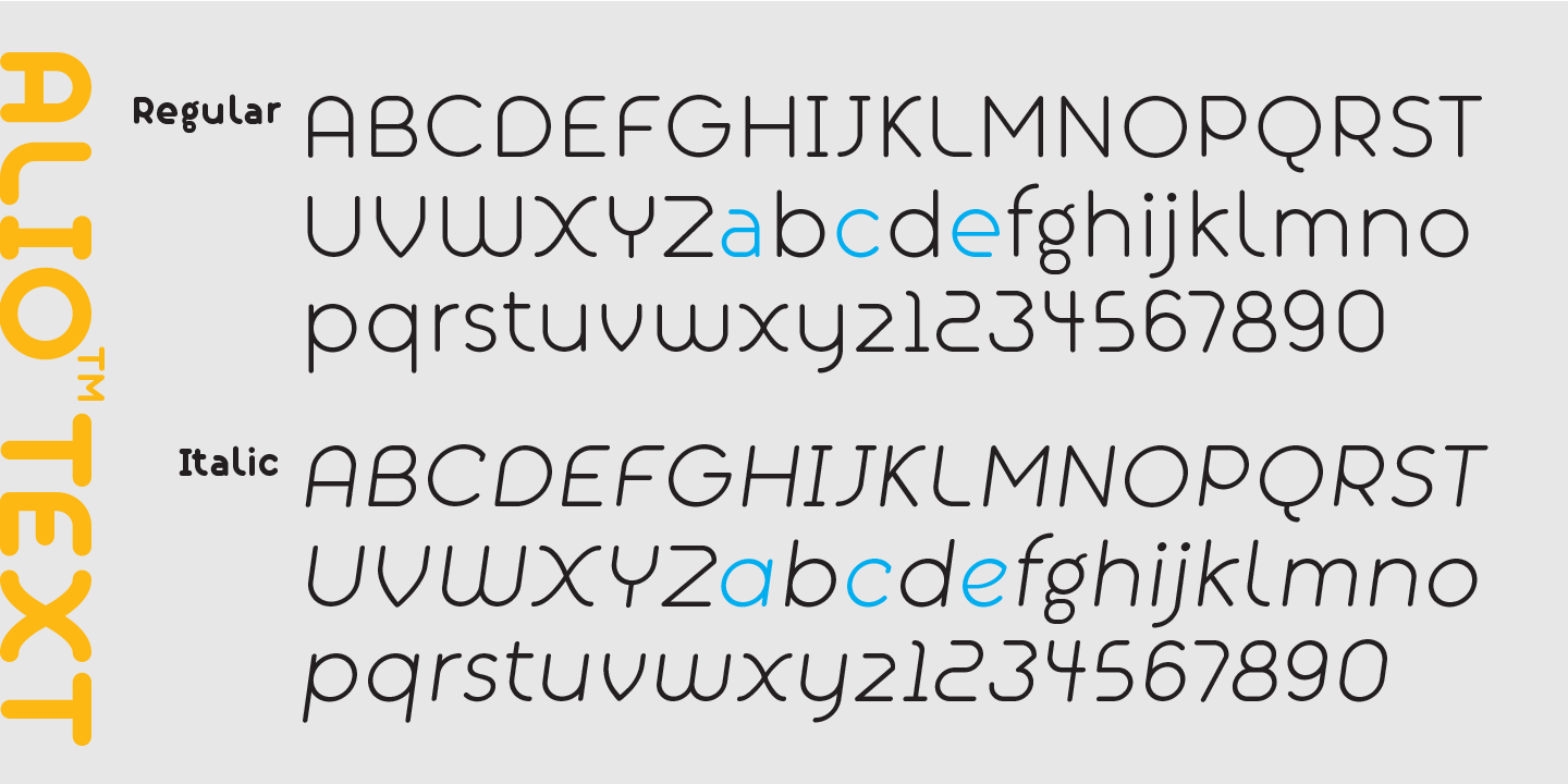
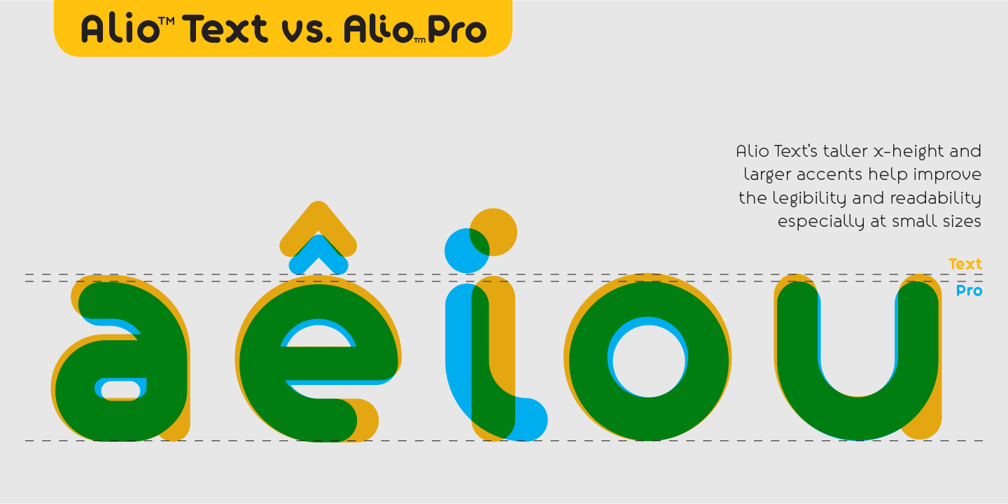

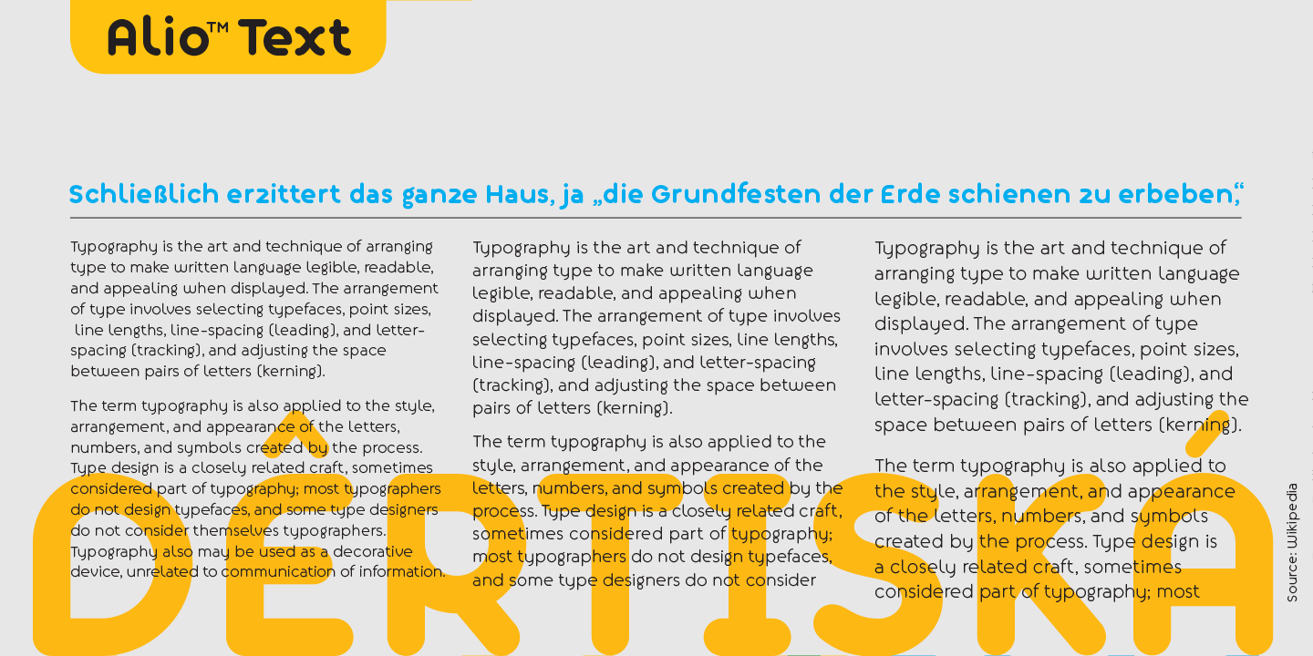
Alio™ Text is the workhorse of the Alio family. It works beautifully on both digital and prints as display type, body copy, and anything in between. We redesigned Alio Text with a taller x-height, more pronounced accents, and wider letter spacing than its siblings, Alio™ Pro.
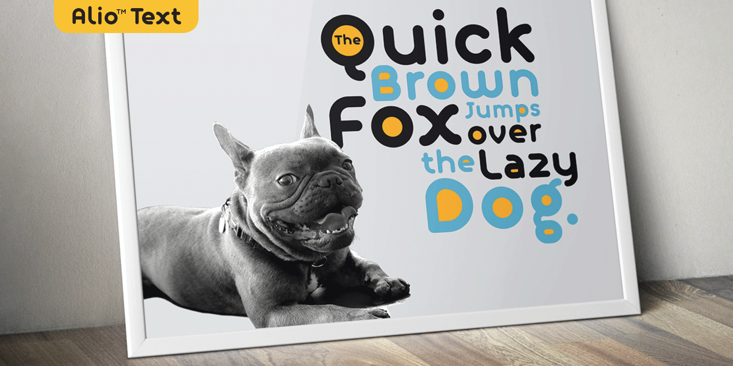
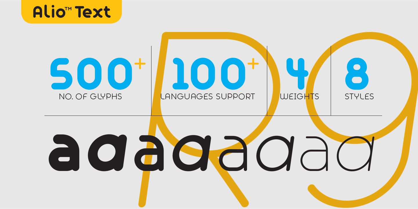
We also cut down from 6 weights/12 styles to 4 weights/8 styles. All of these are to ensure the legibility and readability, and to maximize the weight contrast at small sizes. The round geometric design of Alio Text gives the typeface a friendly and approachable vibe, perfect for branding.
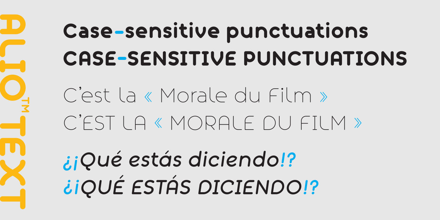
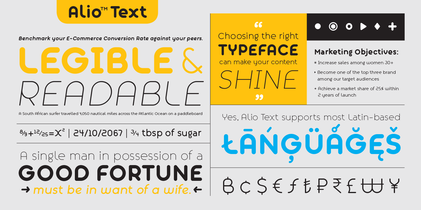
Whether your projects call for all caps, title case, sentence case, or all lowercase, Alio Text has got you covered with case-sensitive punctuations. No more baseline shift, all your punctuations.
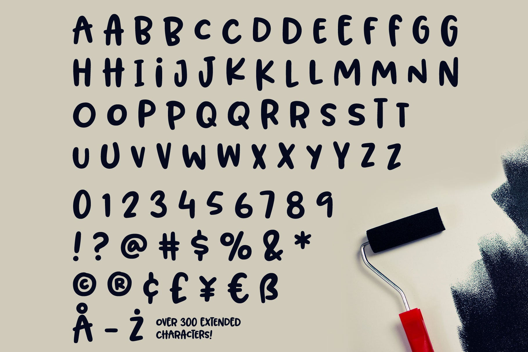
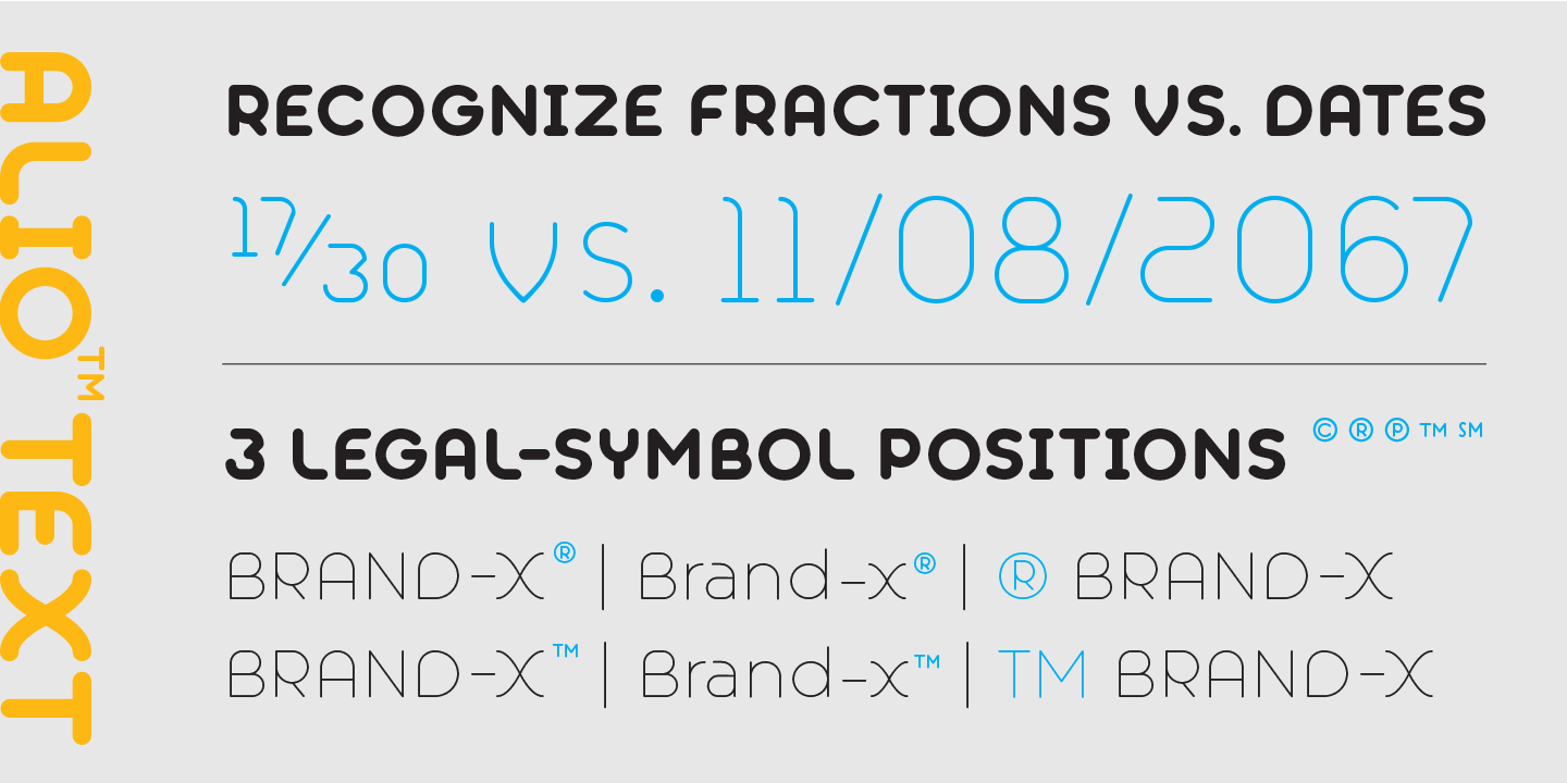
Alio Text supports most Latin-based languages and even the Chinese Pin-Yin. This typeface is also packed with OpenType features similar to Alio Pro. For example, both recognize fractions vs. dates; Both feature several alternate positions for the legal symbols (3 in Alio Text; 5 in Alio Pro). If you’re looking for a go-to, versatile, and modern typeface that works across platforms from the web to print, Alio Text is for you. (4 weights/8 font styles, 500+ glyphs each).